Motivation
Our motivation for starting this project was to create a programmable simulation framework which would add an explicit spatial dimension to population genetics models. Specifically, the original idea was to be able to take models such as the one here—

representing a very simplified view of the history of anatomically modern humans (AMH) in West Eurasia over the last ~50 thousand years (a comprehensive overview can be found in a review by Lazaridis)—and design a tool which makes it possible to simulate such models in an explicit geographical context to capture processes similar to those in the following figure (taken from a study by Haak et al. 2015):
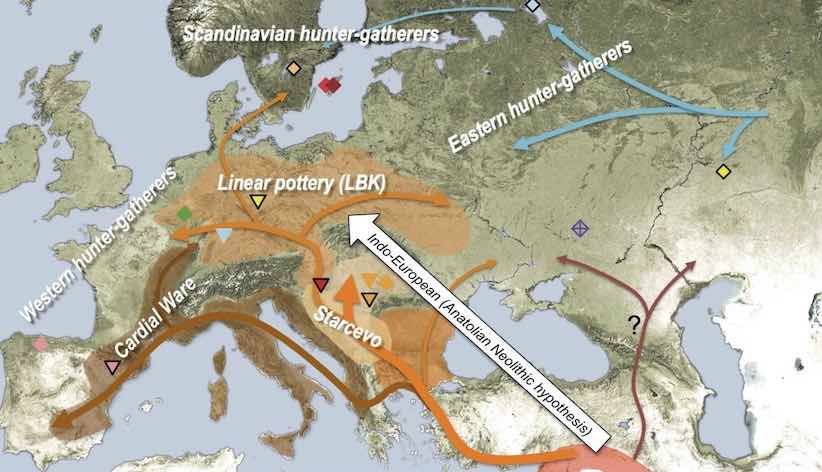
The reason for doing this is probably clear. A lot of what we do in studying the history of humans and other species is focused on reconstructing population movements, expansions and gene flow events, all of which happen in a geographic context. In fact, this geographic component is often what we are most interested in (i.e., “Where did the ancestors of some population come from?”, “By which route and how fast did they migrate?”, etc.). However, this goes beyond just simulating demographic history. For instance, selection pressure driving adaptation can often be spatially heterogeneous: members of a population occupying one part of the continent could be exposed to a different environmental pressure than individuals elsewhere, and allele frequency distributions shaped by the adaptation process would reflect this spatial heterogeneity accordingly. Having a framework that enables the simulation of explicitly spatial genomic data in such situations would allow us to build more realistic models and test more specific hypotheses, goals that are simply not possible using non-spatial simulation methods.
The R package slendr introduced in this vignette presents such a framework. Internally, the package has two independent but tightly interconnected units:
An R interface which provides a set of functional primitives (a “mini-language” of sorts) for encoding various features of spatio-temporal models: population migrations, expansions and gene flow, all happening on a real geographic landscape defined by freely available cartographic data. Populations are represented as simple R objects with easily visualized spatial boundaries, making it possible to build very complex models interactively from a set of small and simple building blocks.
A SLiM simulation back end represented by a built-in generic SLiM script designed to read all the spatio-temporal model configuration parameters and objects established in step 1. above, and tailor the simulation run to the user-defined model. Alternatively, slendr also supports executing standard population genetics models in a random-mating setting. This means that models do not need an explicit geographic map and can be simulated either with the same built-in SLiM back end script, or with a more efficient msprime back end which is also provided with the package.
The most important design objective was to make the integration of parts 1. and 2. appear completely seamless. Even for extremely complex models, the model building and execution (i.e., simulation) can be performed without leaving the convenience of an R interface such as RStudio. All the simulation complexities happen automatically under the hood and knowledge of SLiM is not required. In fact, the motto of the slendr package is “Write complex spatiotemporal population genetics models as a simple R script.”
Geospatial data
Geospatial analysis is a deep and complex topic, with dozens of libraries and programs designed to deal with the fact that the Earth is a three-dimensional object but we are forced to plot geographical objects (and, in our case, simulate data) on a two-dimensional plane.
Luckily, most of the technical issues with Coordinate Reference Systems, transformations between them and manipulation of geometric objects (shifting of population boundaries, expansions, etc.) are pretty much solved now. Unfortunately, dealing with these issues in practice is quite challenging and requires a non-trivial degree of domain expertise. Programming even a very simple task in geospatial data analysis also often requires a lot of code.
This R package is designed to provide a collection of primitives (a “mini-language” of sorts) for programming population dynamics (splits, movement, gene flow, and expansion of spatial boundaries) across space and time without having to explicitly deal with any of the challenges inherent to geospatial analyses.
Installation and setup
The slendr R package is available on CRAN and can be
installed simply by running install.packages("slendr"). If
you need to run the latest development version (for instance, if you
need the latest bugfixes), you can get it via R package
devtools by executing
devtools::install_github("bodkan/slendr") in your R
terminal. You can find more detailed installation instructions in this vignette.
Once you get slendr installed, you just need to load it:
library(slendr)

# activate the internal Python environment needed for simulation and
# tree-sequence processing
init_env()
#> The interface to all required Python modules has been activated.If some of its dependencies (such as SLiM or necessary Python modules) are missing, you will get an informative message on how to proceed.
Defining the overall world map
Before we do anything else, we need to define a section of the map of the world which will provide context for all downstream spatio-temporal manipulation of population ranges.
In principle, any source of geospatial data which can be manipulated using the simple features (sf) infrastructure could be used. For now the slendr package implicitly uses the Natural Earth project data (in its vectorized form!), which it internally loads using the rnaturalearth interface.
The first slendr function we will look at is
map(). This function will load the map of the entire world
in a vectorized format and zoom in to a specified section of the
world.
Note that in the call below, we specify the coordinates of the zoom in a geographical Coordinate Reference System (CRS), longitude/latitude, but we also specified that we want to perform all the downstream manipulation of the spatial population maps in a projected CRS (Lambert Azimuthal Equal-Area projection) which is more appropriate for representing the wider European continent used in this tutorial. Of course, different CRS projections could be used based on which part of the world we want to simulate. Describing the intricacies of coordinate reference systems is beyond the scope of this tutorial, but if you’re interested in learning more I encourage you to read this freely available textbook dedicated to this topic.
This is the approach of slendr: let the user specify everything in an easy-to-understand longitude/latitude geographical CRS (which can be read from any map, making it very easy to define spatial boundaries and trajectories of movement), but the internal data structures and the final exported spatial maps are internally handled in a projected CRS, which is important to make sure that distances and proportions are not distorted.
map <- world(
  xrange = c(-13, 70), # min-max longitude
  yrange = c(18, 65),  # min-max latitude
  crs = "EPSG:3035"    # coordinate reference system (CRS) for West Eurasia
)
Internally, the map object is currently a normal
sf class object without additional components. This is
unlike other slendr objects described below, which are also
sf objects but which carry additional internal
components.
Note that the summary of the object says “projected CRS: ETRS89-extended / LAEA Europe”. This means that the world map has indeed been transformed into the projected CRS we specified above.
map#> slendr 'map' object
#> -------------------
#> map: internal coordinate reference system EPSG 3035
#> spatial limits (in degrees longitude and latitude):
#> - vertical -13 ... 70
#> - horizontal 18 ... 65Plotting geographic features and population ranges
The slendr package implements its own plotting function
called plot_map().
We do this in order to make it easier and more convenient to
iteratively build more complex models. The function can intelligently
decide (based on given input arguments) the right way to present the
data to the user, which helps to define models more quickly without
relying on the lower-level mechanisms of the sf package.
You will see some examples of plot_map() in action
below.
Defining smaller geographic regions
In addition to the overall spatial map context, we can also define smaller geographic boundaries. This is mostly useful whenever we want to restrict a population’s movement (such as spatial population expansion) to a smaller region of the map that has some intuitive geographic meaning (i.e., Anatolia, West Eurasia, etc.).
africa <- region(
  "Africa", map,
  polygon = list(c(-18, 20), c(38, 20), c(30, 33),
                 c(20, 33), c(10, 38), c(-6, 35))
)
europe <- region(
  "Europe", map,
  polygon = list(
    c(-8, 35), c(-5, 36), c(10, 38), c(20, 35), c(25, 35),
    c(33, 45), c(20, 58), c(-5, 60), c(-15, 50)
  )
)
anatolia <- region(
  "Anatolia", map,
  polygon = list(c(28, 35), c(40, 35), c(42, 40),
                 c(30, 43), c(27, 40), c(25, 38))
)
Note that the objects created above are not population boundaries (not yet anyway)! These are simply labels for some generic geographic boundaries that can be used later. They are not attached to any population at this point.
Again, the object returned by the region() function is
actually an sf object, but carries some additional
annotation such as the name of the region (here “Anatolia”):
anatolia#> slendr 'region' object
#> ----------------------
#> name: Anatolia
#>
#> map: internal coordinate reference system EPSG 3035However, the object also carries additional class annotations for the purpose of internal slendr machinery:
class(anatolia)#> [1] "slendr" "slendr_region" "sf" "data.frame"Furthermore, note that in all region() calls we
specified the map object that we defined at the very
beginning. This object is added as a hidden attribute to each
slendr object and represents the context for all geospatial
transformations, expansions, and plots.
We can use the generic plot_map() function to plot these
geographic regions in the context of the defined section of the world
map:
plot_map(africa, europe, anatolia, title = "Geographic regions")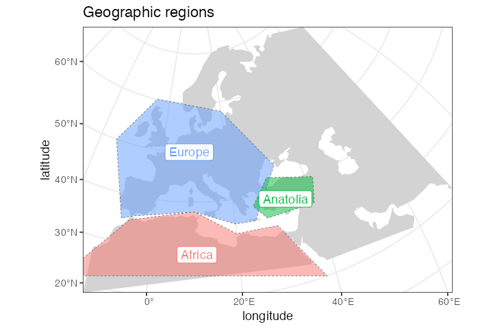
Note that the map object is no longer explicitly
specified. It is not needed, because each other class of objects
provided to the plot_map() function must carry it as a
“map” attribute. In fact, each such object must carry the same map
context — slendr complains whenever this is not the case.
We can check that the component is really there, although hidden,
using the built-in attr function and verify that it is the
same as the map object we created at the beginning:
#> [1] TRUE#> [1] TRUEDefining spatial population boundaries
One of the aims of the slendr package is to formalize the
specification of spatial population boundaries and their changes over
time. The core function for this is population(), which
takes a population name, the time at which we
want to enforce that population’s boundary, the effective population
size of the population at that time, and the map object
described above. We also have to specify which existing population the
specified population split from (or explicitly say that it’s an
ancestral population). As for specifying the actual spatial boundaries,
we have several options.
Polygon population ranges
We can define detailed population boundaries using a polygon geometry
object or a region object created by the region() function
above, using a polygon = argument to
population(). Again, as a reminder, note that all
coordinates are described in the context of the geographic CRS.
First, let’s create the African ancestors of modern humans. We
restrict the spatial boundary of the African population to the
africa region defined above:
afr <- population("AFR", time = 52000, N = 3000, map = map, polygon = africa)

plot_map(afr)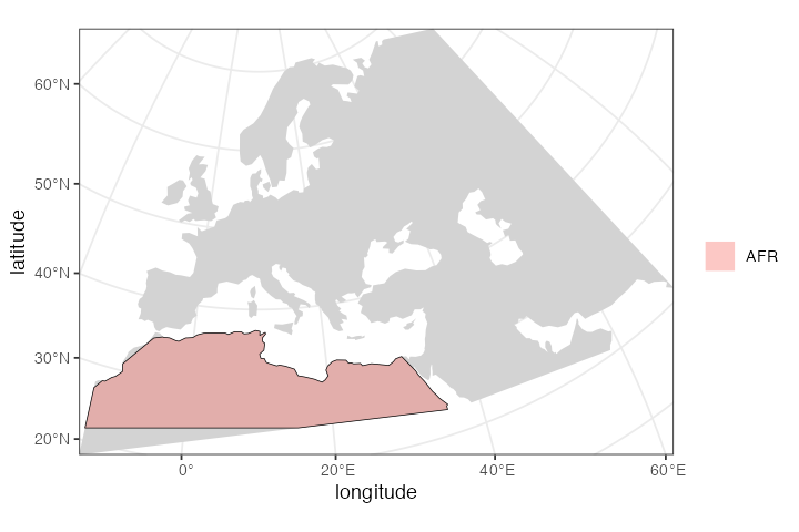
Circular population ranges
If we want to simulate a more abstract and simple population
boundary, we can specify a circular range with center and
radius arguments instead of a polygon. All distance units
in the slendr package are specified in the coordinate system
given during “world creation”. For instance, EPSG 3035 (which we’re
using here) specifies distances in meters.
Here we define the location of the population of non-Africans right after their split from their African ancestors:
ooa <- population(
  "OOA", parent = afr, time = 51000, N = 500, remove = 25000,
  center = c(33, 30), radius = 400e3
)
If we call the plot_map() function on the returned
object, we have the option to either plot the population range in its
“raw” form or in its “intersected” form, in which case the raw boundary
is intersected with the “background” landscape (removing large bodies of
water, etc.).
The intersected form is what is ultimately exported in a serialized
format (see below) to be loaded as a spatial map into SLiM. This is why
the plot_map() function renders intersected population
ranges by default.
plot_map(ooa, intersect = TRUE, title = "'Intersected' population range")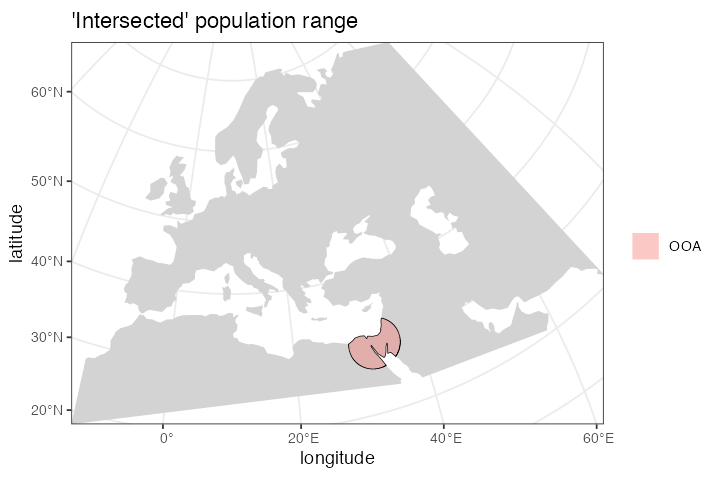
Population movement across a landscape
To describe a directional population movement, we can use the
function move(). This accepts the coordinates of the
destination points along the way (trajectory) and the
duration of the migration, and automatically generates a
number of intermediate spatial maps along the trajectory of movement to
produce a reasonable degree of spatial continuity (this number can be
also specified manually).
ooa <- ooa %>% move(
  trajectory = list(c(40, 30), c(50, 30), c(60, 40)),
  start = 50000, end = 40000
)
We can inspect the object returned by the move()
function and see that it now contains not just the first YAM population
range at 7000 years ago, but also the ranges of the intermediate
locations:
ooa#> slendr 'population' object
#> --------------------------
#> name: OOA
#> habitat: terrestrial
#>
#> number of spatial maps: 28
#> map: internal coordinate reference system EPSG 3035
#> scheduled removal at time 25000
#>
#> population history overview:
#> - time 51000: split from AFR (N = 500)
#> - time 50000-40000: movement across a landscapeChecking the result visually again, we see:
plot_map(ooa, title = "Intermediate migration maps")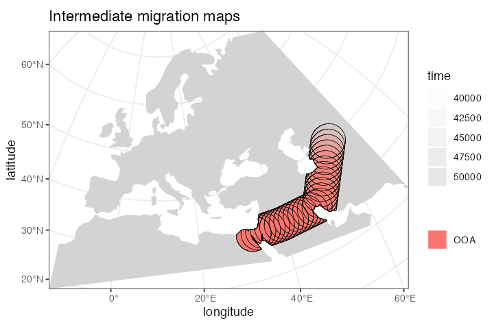
Let’s create a population of Eastern Hunter Gatherers (EHG), which split from the first non-Africans 28000 years ago:
ehg <- population(
  "EHG", parent = ooa, time = 28000, N = 1000, remove = 6000,
  polygon = list(
    c(26, 55), c(38, 53), c(48, 53), c(60, 53),
    c(60, 60), c(48, 63), c(38, 63), c(26, 60))
)
While we’re at it, let’s also create a population of Western Hunter Gatherers (WHG). Because the people living in this region eventually became present day Europeans after receiving gene flow from other groups over time (see below), we will call them “EUR” to simplify the modeling code a little bit:
eur <- population( # European population
  name = "EUR", parent = ehg, time = 25000, N = 2000,
  polygon = europe
)
Spatial population expansion
We can simulate the expanding range of a population using the
function expand_range(), which accepts parameters
specifying how many kilometers the boundary should expand by (the
by argument), how long should the expansion should take
(the duration argument) and how many intermediate spatial
map snapshots should be exported representing the expansion (the
snapshots argument).
For instance, let’s represent the expansion of Anatolian farmers, who
also split from the OOA population at 28000 years ago at the time of the
split of the EHG population. Note that we use an optional parameter,
polygon, which restricts the expansion only to Europe,
instead of all around Anatolia:
ana <- population( # Anatolian farmers
  name = "ANA", time = 28000, N = 3000, parent = ooa, remove = 4000,
  center = c(34, 38), radius = 500e3, polygon = anatolia
) %>%
  expand_range( # expand the range by 2.500 km
    by = 2500e3, start = 10000, end = 7000,
    polygon = join(europe, anatolia)
  )
Note that, in principle, you could specify the entire spatio-temporal
history of a population in a single pipeline using the pipe operator
%>%.
Again, we can inspect the object returned by the
expand_range() function and see that it contains the
spatial maps (“snapshots”) of the expansion process across time:
ana#> slendr 'population' object
#> --------------------------
#> name: ANA
#> habitat: terrestrial
#>
#> number of spatial maps: 16
#> map: internal coordinate reference system EPSG 3035
#> scheduled removal at time 4000
#>
#> population history overview:
#> - time 28000: split from OOA (N = 3000)
#> - time 10000-7000: range expansionWe can (and should) check the results visually:
plot_map(ana, title = "Anatolian expansion into Europe")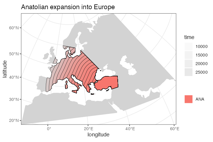
To visually see what is really going on behind the scenes, you can also plot the raw, non-intersected form of the expansion with:
plot_map(ana, title = "Anatolian expansion into Europe (not intersected)", intersect = FALSE)We can see that the population of Anatolian farmers at some point invades the spatial boundary of the EUR population. On its own, this doesn’t imply gene flow. In the section on gene flow below, we will see how slendr implements gene flow between overlapping (or non-overlapping) populations.
Let’s add a couple more populations and migrations before we move on to implementing gene flow between them.
Yamnaya steppe herders:
yam <- population( # Yamnaya steppe population
  name = "YAM", time = 7000, N = 500, parent = ehg, remove = 2500,
  polygon = list(c(26, 50), c(38, 49), c(48, 50),
                 c(48, 56), c(38, 59), c(26, 56))
) %>%
  move(
    trajectory = c(15, 50),
    start = 5000, end = 3000, snapshots = 8
  )

plot_map(yam)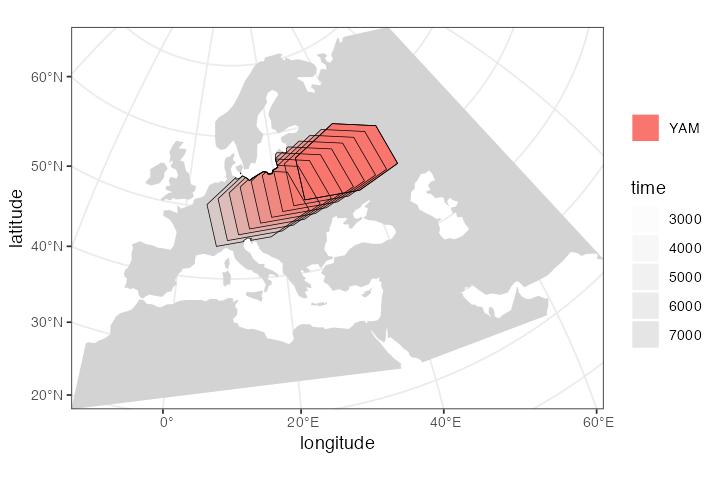
Plotting multiple slendr objects
In addition to plotting individual population ranges, the generic
function plot_map() can handle a combination of population
ranges, and can also partition them into individual facets. This is
useful for visual inspection of the specified model, and for looking for
potential issues before the export of individual spatio-temporal maps.
Obviously, this is a lot of multi-dimensional information:
plot_map(afr, ooa, ehg, eur, ana, yam)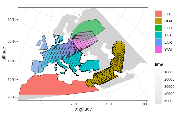
Below you will see a better way to explore a slendr model interactively.
Defining gene flow events
The way slendr implements gene flow events is by calling the
gene_flow() function. This function has a very
straightforward interface, shown below.
One thing to note is that by default, the from and
to populations for gene flow events must have overlapping
spatial ranges in order to simulate gene flow. This is probably rather
obvious, as populations can’t mix in space-time if they don’t overlap at
a given point in space-time.
For example, if you look at the spatial boundaries plotted above, you’ll see that the European and African populations don’t have any overlap in population ranges. If we try to instruct slendr to simulate geneflow between them, we will get an error:
gf <- gene_flow(from = eur, to = afr, rate = 0.1, start = 20000, end = 15000)Error: No overlap between population ranges of EUR and AFR at time 20000.
Please check the spatial maps of both populations by running
`plot_map(eur, afr)` and adjust them accordingly. Alternatively, in case
this makes sense for your model, you can add `overlap = F` which
will instruct slendr to simulate gene flow without spatial overlap
between populations.The error message instructs us to visually verify that this is the
case, which can be done by slendr’s plot_map()
function and the optional parameter pop_facets = F (which
is set to TRUE by default).
Many models will include multiple gene flow events, which we can collect in a simple R list:
gf <- list(
  gene_flow(from = ana, to = yam, rate = 0.5, start = 6500, end = 6400, overlap = FALSE),
  gene_flow(from = ana, to = eur, rate = 0.5, start = 8000, end = 6000),
  gene_flow(from = yam, to = eur, rate = 0.75, start = 4000, end = 3000)
)
The gene_flow() function simply returns a data frame
collecting all the geneflow parameters for the
compile_model() step below:
gf#> [[1]]
#> from_name to_name tstart tend rate overlap
#> 1 ANA YAM 6500 6400 0.5 FALSE
#>
#> [[2]]
#> from_name to_name tstart tend rate overlap
#> 1 ANA EUR 8000 6000 0.5 TRUE
#>
#> [[3]]
#> from_name to_name tstart tend rate overlap
#> 1 YAM EUR 4000 3000 0.75 TRUECompile the whole model and load it in SLiM
The most crucial function of slendr is
compile_model(). It takes all population ranges defined
across space and time, together with a list of gene flow events
(optional, since some models won’t include gene flow), and then proceeds
by converting all vectorized spatial ranges into raster bitmaps.
Furthermore, it compiles all information about split times,
values, gene flow directions, times, and rates into a series of tables.
All of that will be saved automatically in a dedicated directory in a
format that is understood by the back end SLiM script provided by
slendr (more on that below).
model_dir <- paste0(tempfile(), "_tutorial-model")

model <- compile_model(
  populations = list(afr, ooa, ehg, eur, ana, yam), # populations defined above
  gene_flow = gf, # gene-flow events defined above
  generation_time = 30,
  resolution = 10e3, # resolution in meters per pixel
  competition = 130e3, mating = 100e3, # spatial interaction in SLiM
  dispersal = 70e3, # how far will offspring end up from their parents
  path = model_dir
)
What do the files in the model directory look like? Ideally, you as a user should never worry about that; in fact, the whole purpose of slendr is to let you work at a much higher level of abstraction without worrying about such low-level details. That said, you might find it useful to see what things look like behind the curtain…
First of all, we can inspect the contents of the directory and see that it does, indeed, contain all defined spatial maps (now PNG files, which is what SLiM requires).
list.files(model_dir, pattern = "*.png")#> [1] "1.png" "10.png" "11.png" "12.png" "13.png" "14.png" "15.png" "16.png"
#> [9] "17.png" "18.png" "19.png" "2.png" "20.png" "21.png" "22.png" "23.png"
#> [17] "24.png" "25.png" "26.png" "27.png" "28.png" "29.png" "3.png" "30.png"
#> [25] "31.png" "32.png" "33.png" "34.png" "35.png" "36.png" "37.png" "38.png"
#> [33] "39.png" "4.png" "40.png" "41.png" "42.png" "43.png" "44.png" "45.png"
#> [41] "46.png" "47.png" "48.png" "49.png" "5.png" "50.png" "51.png" "52.png"
#> [49] "53.png" "54.png" "55.png" "56.png" "57.png" "6.png" "7.png" "8.png"
#> [57] "9.png"It also contains a series of tab-delimited configuration tables. These tables contain summaries of the model parameters that we defined graphically above, namely:
- the table of population splits:
read.table(file.path(model_dir, "populations.tsv"), header = TRUE)#> pop parent N tsplit_gen tsplit_orig tremove_gen tremove_orig
#> 1 AFR __pop_is_ancestor 3000 1 52000 -1 -1
#> 2 OOA AFR 500 34 51000 901 25000
#> 3 EHG OOA 1000 801 28000 1534 6000
#> 4 ANA OOA 3000 801 28000 1601 4000
#> 5 EUR EHG 2000 901 25000 -1 -1
#> 6 YAM EHG 500 1501 7000 1651 2500
#> pop_id parent_id
#> 1 0 -1
#> 2 1 0
#> 3 2 1
#> 4 3 1
#> 5 4 2
#> 6 5 2- the table of geneflow events:
read.table(file.path(model_dir, "geneflow.tsv"), header = TRUE)#> from to rate overlap tstart_gen tstart_orig tend_gen tend_orig from_id to_id
#> 1 ANA YAM 0.50 0 1518 6500 1521 6400 3 5
#> 2 ANA EUR 0.50 1 1468 8000 1534 6000 3 4
#> 3 YAM EUR 0.75 1 1601 4000 1634 3000 5 4- and finally, the table of populations whose spatial maps will be updated throughout the simulation, as well as the times of those updates (this table is rather large, so we’re not showing it here).
The object returned by the compile_model() function
(called model here) binds all of this information together.
In fact, for easier debugging and sanity checking, it carries the
locations of these tables (as well as other important information)
inside itself, as elements of a list: model$splits,
model$geneflows, etc.
In case you’d want to separate model specification and running into
different scripts, slendr includes a function
read_model() just for this purpose:
loaded_model <- read_model(model_dir)Visualize the entire history of splits and gene flow
With the code snippets above, we have defined a simple history of European populations over the last 50000 years. This history includes population splits and gene flow events, as well as other demographic changes. While slendr tries to make the formal specification of spatio-temporal population dynamics as concise as possible, it is hard to really visualize everything that will happen on the SLiM side after the simulation starts just from the code alone.
For this purpose, the package includes a function named
plot_model() which takes in all the information about the
relationships between populations (i.e., the population and gene flow
objects we defined above) and plots it all in the form of a so-called
admixture graph (see here for a
discussion of the admixture graph concept).
One important thing to note here is that unlike traditional admixture graphs where each node/population is present only once, in the full slendr graph a single population can participate in many gene flow events over the course of its history. This is visualized by assigning a color to each population, and different nodes of the same color represent snapshots in time when a demographic event affecting that population happens.
plot_model(model, proportions = TRUE)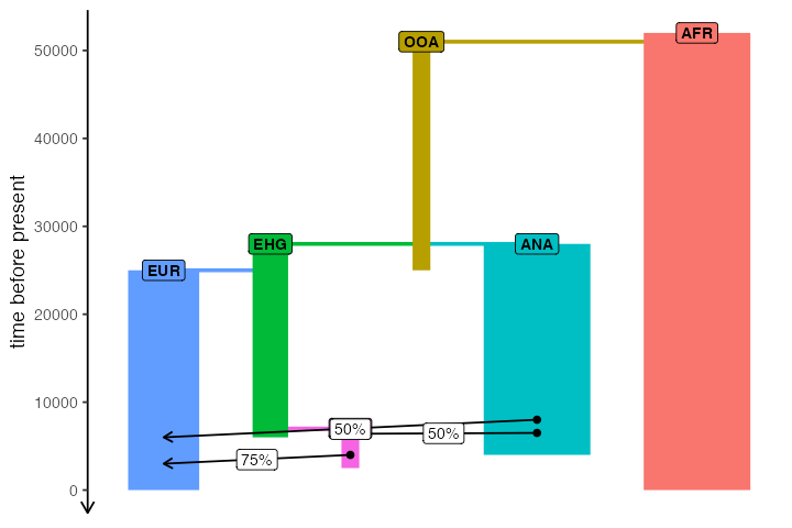
Interactive exploration of spatio-temporal models
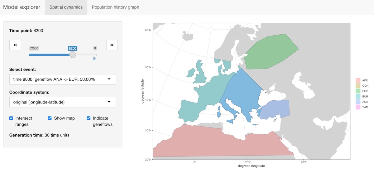
A slightly fancier way to visualize models is implemented in the
function explore_model(). This function accepts a compiled
model as its only parameter and spawns an R shiny-based browser app which makes
it possible to click through the time snapshots interactively and
visualize the spatial maps in each time point.
explore_model(model)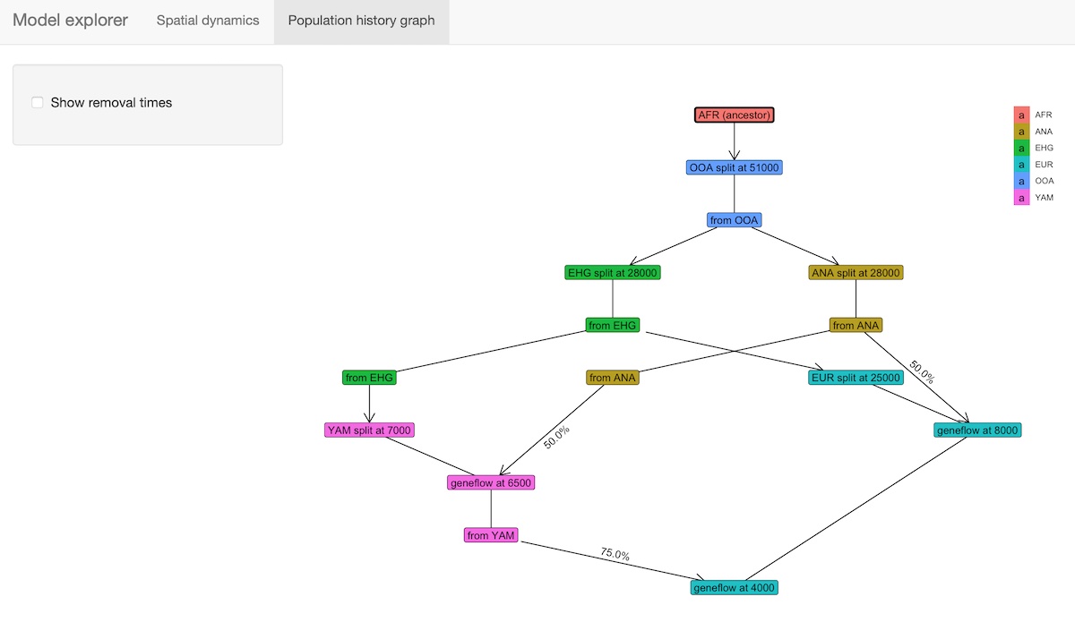
Running the simulation
The way we feed the entire serialized model into SLiM is through the
slim() function, which understands the format of the model
directory created by the compile_model() function and
generates a SLiM script (using a back end skeleton script which is a
part of this package and can be found by calling
system.file("scripts/script.slim", package = "slendr"), in
case you’d like to peek into its internals).
The output of a slendr simulation is a tree-sequence file (here produced by the SLiM simulation behind the scenes). This tree sequence is then automatically loaded into R and returned to the user:
ts <- slim(model, sequence_length = 100000, recombination_rate = 1e-8)
ts
#> ╔═══════════════════════╗
#> ║TreeSequence ║
#> ╠═══════════════╤═══════╣
#> ║Trees │ 116║
#> ╟───────────────┼───────╢
#> ║Sequence Length│100,000║
#> ╟───────────────┼───────╢
#> ║Time Units │ ticks║
#> ╟───────────────┼───────╢
#> ║Sample Nodes │ 10,000║
#> ╟───────────────┼───────╢
#> ║Total Size │2.7 MiB║
#> ╚═══════════════╧═══════╝
#> ╔═══════════╤══════╤═════════╤════════════╗
#> ║Table │Rows │Size │Has Metadata║
#> ╠═══════════╪══════╪═════════╪════════════╣
#> ║Edges │18,665│583.3 KiB│ No║
#> ╟───────────┼──────┼─────────┼────────────╢
#> ║Individuals│12,810│ 1.2 MiB│ Yes║
#> ╟───────────┼──────┼─────────┼────────────╢
#> ║Migrations │ 0│ 8 Bytes│ No║
#> ╟───────────┼──────┼─────────┼────────────╢
#> ║Mutations │ 0│ 1.2 KiB│ No║
#> ╟───────────┼──────┼─────────┼────────────╢
#> ║Nodes │18,345│664.5 KiB│ Yes║
#> ╟───────────┼──────┼─────────┼────────────╢
#> ║Populations│ 6│ 2.6 KiB│ Yes║
#> ╟───────────┼──────┼─────────┼────────────╢
#> ║Provenances│ 1│ 43.2 KiB│ No║
#> ╟───────────┼──────┼─────────┼────────────╢
#> ║Sites │ 0│ 16 Bytes│ No║
#> ╚═══════════╧══════╧═════════╧════════════╝There is lots more that slendr allows you to do, both in terms of the simulation itself, but also in terms of analyzing tree-sequence data. The list below provides a list of additional resources you might want to look at.
More information
This vignette described only the most basic features of the slendr package but it is already quite long. There is much more to slendr than what we demonstrated here. For instance:
You can tweak parameters influencing dispersal dynamics (how “clumpy” populations are, how far offspring can migrate from their parents, etc.) and change how those dynamics evolve over time. See this vignette for more information.
You can use slendr to program non-spatial models, which means that any standard, Wright-Fisher demographic model can be simulated with only a few lines of R code and, for instance, plugged into an Approximate Bayesian Computation pipeline or other analyses leveraging readily available R packages. You can find more in this vignette and a much more detailed example in a vignette about SLiM and msprime back ends.
You can build complex spatial models which are still abstract (not assuming any real geographic location), including traditional simulations of demes in a lattice structure. A complete example is shown in this vignette.
Because SLiM saves data in the
.treestree-sequence file format, thanks to the R package reticulate for interfacing with Python code you have the incredible power of tskit and pyslim to process simulated data at a massive scale right at your fingertips, all within the convenient environment of R. See a much more detailed example in a vignette about this vignette for an extensive tutorial of this feature.
